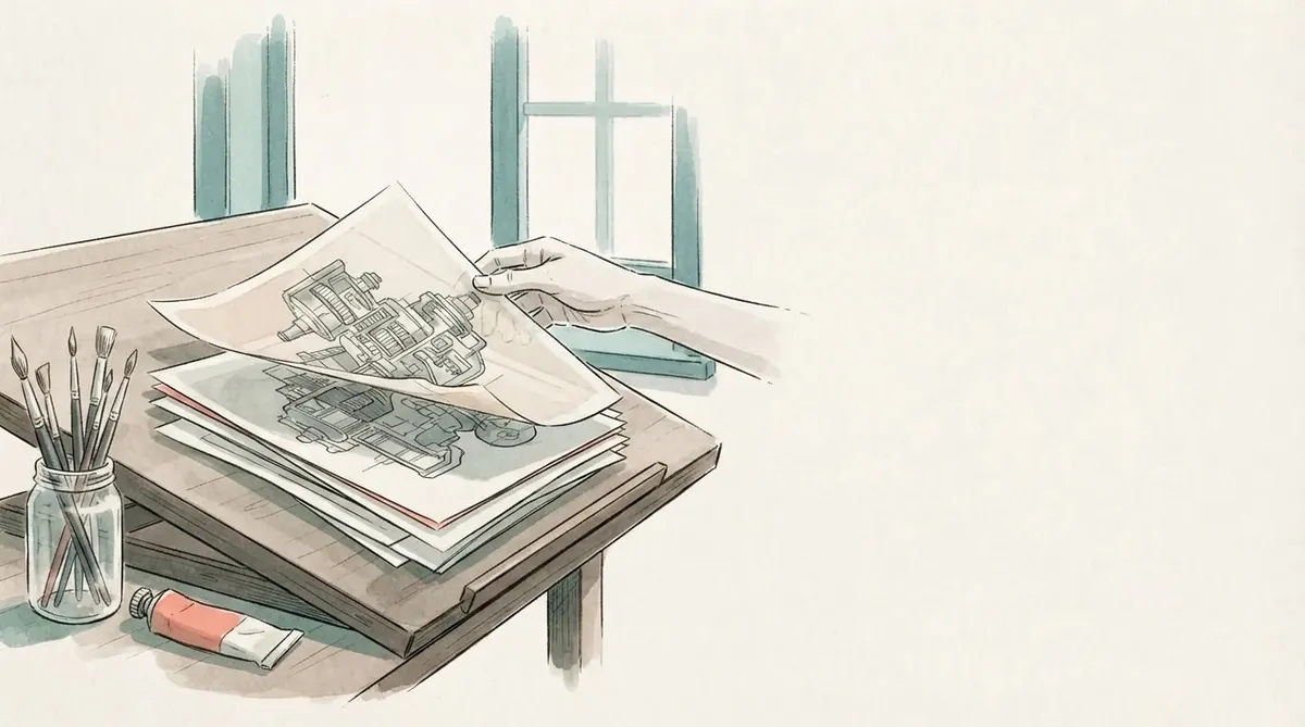
Every post on this blog now has a picture behind its title, and a card with the title drawn into it for when the link is shared. Thirty-three generations, a little over a dollar, one afternoon. The picture at the top of this post is one of them. The card is what you saw if you arrived from social media.
I do enjoy a good image to go along with a blog post, it's how I was brought up I feel like. The post feels empty without it, but maybe I'm just an old-fashioned millennial. But it's always been tricky to source images. I've done that in previous projects but it never feels good and coherent.
Now in 2026 we can generate images that fit the design perfectly for the blog, and the colour scheme and everything, so that is what I have done now.
The condition was that it must not look like it. I wanted images, and I did not want the blog to feel low quality or AI-sloppy. This post is about the second half of that sentence: what made the pictures fit, what the model got wrong, and what the research says about whether a generated picture helps a page at all.
What I was aiming at
I'm thinking about DeepMind and their abstract images they use, it gives a certain feel to the post.
That feel is the target: one visual voice across every post, restrained, obviously drawn for this site and not pulled from a stock library. Not a photograph of a laptop, and not the glossy, over-lit, six-fingered look that has become the visual signature of a page nobody cared about.
It seems like if you should do it you should do it properly so it doesn't look "low quality".
The research backs the caution. Bellaiche et al. (2023) showed people the same pictures labelled either human-made or AI-made. The AI label alone lowered ratings of liking, beauty and worth. Millet et al. (2023) found the same devaluation and traced part of it to how strongly the viewer believes creativity is a human thing. The practical reading for a blog is blunt: a picture that announces itself as generated costs you more than no picture would. Zhou & Lee (2024) looked at an online art platform after text-to-image tools arrived. The people who adopted them produced more and were rated higher by their peers. The pictures also drifted towards looking alike. Read together, those three say: use the tool, hide the tool, and pick your own convergence before the model picks one for you.
Workmanship of risk
David Pye, a furniture maker who taught at the Royal College of Art, drew a line in The Nature and Art of Workmanship (1968) that I keep coming back to. In the workmanship of risk, the quality of the result depends on the maker's judgement at every moment: handwriting, a chisel, a brush. In the workmanship of certainty, quality is fixed before the work starts, by the jig, the mould or the printing press, and the maker's attention no longer decides it. Pye's point was that risk is not a virtue and certainty is not a vice. Good workmanship of risk is the maker regulating the risk, with guides and templates, until the result is dependable.
An image model is workmanship of risk pretending to be certainty. It looks like a printing press: text in, picture out. It is a brushstroke: every generation is a throw, and no two are alike. So the job of not looking sloppy is exactly Pye's job, moving the quality out of the individual throw and into the jig. Four jigs did it here:
- The style is written down once, in
hero-style.txtat the root of the repo, and every prompt starts with it. Here is the whole file: Quiet, restrained editorial illustration for a technical blog. Hand-drawn ink line work with loose watercolour washes on warm off-white paper. A muted palette: mostly greys and warm paper tones, with one teal accent and one coral accent. Lots of empty space; the subject sits to one side and the rest of the frame is paper. No faces, no logos, no borders, no frames, no captions, no watermark. Calm, precise, a little wry. - A reference picture rides along with every prompt. The words alone drifted between posts. The first picture I liked, a drawer of prints, is committed as
hero-style.webpand sent as an image with every request, with an instruction to match its line weight, paper and palette and not its subject. After that the posts came out as a set. - The post supplies only the subject.
hero.prompt.txtnext to each post is two or three sentences about what is in the picture, and nothing about how it is drawn. - Every picture is looked at before it is committed. The tool never runs in the build, so a bad throw is a redo, not a deploy.
The rest of the post is the pipeline those four sit in.
The pipeline
Two subcommands in the site's Rust CLI, both by hand, never from the build:
site-tools hero gen  <slug>    # text-free picture -> hero.webp + hero-thumb.webp
site-tools hero card <slug>    # the same subject with the title drawn in -> card.webp
site-tools hero all            # both, for every post with a prompt and no picture yet
The API is OpenRouter's chat completions endpoint with modalities: ["image", "text"] and a 16:9 aspect ratio. The picture comes back inside the message as a base64 data URL. The tool decodes it and hands it to the same img-optim binary that converts hand-made images, so in the repo a generated hero looks exactly like a photographed one. Two modules of Rust with tests, and curl doing the HTTP, the way the audio pipeline already does.
Which model is a one-line setting. OpenRouter lists nine image-output models this month, all from Google and OpenAI. Qwen-Image, which drew the first hero on this blog in February, is not among them. I tested three:
| Model | Per image | Returns | Verdict |
|---|---|---|---|
| Gemini 3.1 Flash Lite Image | $0.034 | JPEG, 1376x768 | the default |
| Gemini 3.1 Flash Image | $0.067 | PNG, 1376x768 | no visible gain over Lite |
| Gemini 3 Pro Image | higher | not tried; nothing looked like it needed it |
Cost turned out not to matter at all. Twelve posts with a hero and a card each came to about eighty cents. The test runs and the redraws brought the afternoon to a little over a dollar.
The first card the tool wrote did not survive its own build. The picture came back as a JPEG, I saved it next to the post as card.jpg, and build.sh refused to run. The image preflight I wrote in August fails the build on any JPEG or PNG under content/, because deploy.sh runs git add -A and a forgotten 4 MB source is in the history for good. Right call. The card goes through img-optim too now, at quality 90 because text has to survive it, and the rule keeps holding without an exception.
The title in the picture
I know that in the last year the models have made great strides in capability of text rendering as well, which is great for the OG images.
I did not believe this until I tried it. My plan was to compose the title over the picture with Typst, which the site already runs for the PDFs, because I expected the model to misspell anything longer than a word. So I generated one card with the title in the prompt, to have something to argue against. It came back with a 70-character title spelled correctly, broken over three sensible lines, in a serif close to the site's own, with the domain in coral underneath. Seven cents. The plan changed.
The prompt asks for the illustration on the right two thirds, the title on the left third in a classic serif in deep navy, spelled exactly as written, and the site name small in coral below it. Of thirteen first attempts, four came back wrong:
- The first printed
exact: lindfors.no, the word exact leaking out of the instruction and into the picture. The prompt now gives the site name its own line, the way the title has one. - Another put a stray opening quote mark before the title.
- A third printed the site name twice.
- A hero, drawn later, filled a switchboard's label strip with rows of invented lettering. The prompt for that post now says there are no markings on it.
A redraw fixed each one, at three cents. That is the fourth jig doing its job: nothing about the model tells you when it has gone wrong, so somebody has to look. Do not skip that step, and do not let the build generate anything you have not seen.
The Typst step stayed, for a different reason. The share card has to be a 1200x630 PNG, because LinkedIn and Facebook do not reliably accept WebP and the model returns 16:9 at whatever size it likes. So site-tools og all runs in the build and renders static/og/<slug>.png for every published post, with three sources in order:
- The model's
card.webp, cover-fitted to 1200x630, nothing added. - No card: the hero, with the title, the site and the date composed over a gradient.
- No hero either: the title on the dark palette.
Typst reads WebP, exports PNG and has the site's fonts on its font path. Its output is byte-identical between runs, so an unchanged post does not dirty the repo. The templates point og:image and twitter:image at that path for every post, so nothing ever falls back to the generic site image again. The two posts that had heroes from August were the last to be redrawn, so every card on the site is now the model's.
Putting the title on the picture
Once every post had a picture, the post header had a problem: the title block, then a full-width picture, then the article. A whole band of scrolling before the first sentence. The picture now sits behind the title and description, under the same navy scrim the cards use, and the article starts one band sooner. The featured cards on the front page got the same treatment: the lead card carries the full hero with its text on it, the two smaller ones use their thumbnails.
Checking that on a phone turned up an unrelated bug from February. Markdown tables with paths in their cells were wider than a 390px viewport and scrolled the whole page sideways. They scroll in their own box now.
What I'd tell you
Write the style down before you draw anything. One paragraph, in a file, sent with every prompt. Then find the one picture you like most and send that too. The reference picture did more for consistency than any wording did.
Keep the subject and the style apart. The post says what is in the picture. The site says how pictures look here. Mixing them is how the fourth post comes out in a different hand from the first three.
Let the model spell the title, and keep a composed fallback. It works now, it looks better than composed text, and one redraw in three or four is the price. The fallback means every post has a card whether or not you paid for one.
Look at every picture. The failures are quiet: a leaked word, a doubled line, a quote mark. Three cents to redraw, but only if somebody notices.
Convert it like any other image. Same tool, same format, same size cap, same preflight. The moment a generated picture is a special case in the repo, it will be the one that breaks the build.
The pipeline runs on Zola, Typst, one Rust CLI and OpenRouter. The pictures are drawn by a model. The blog, I hope, does not look like it.